- By Dan Veaner
- Business & Technology
 Print
Print  For Apple geeks Tuesday was one of those exciting announcement days. Apple introduced the new 64 bit iPadAir and iPad Mini. And the newest version of the OS X Mac operating system -- named 'Mavericks' -- was released. Of course I clicked 'Install' as soon as I saw it in the App store. Two hours later (about 45 minutes to download, about 45 minutes to install, 20 minutes of watching TV and forgetting to check upgrade progress and ten minutes of watching that 'less than a minute' message on the progress bar) my Mac was back up and running with 200 new features.
This is the first version of the Mac OS that hasn't been named after a cat. Critics will note that it is named after a cow: a maverick is an unbranded calf. But it is also an independent minded person, and I'm pretty sure that's what Apple is going for. The good news for existing Mac users is that there won't be a learning curve. I was able to resume my work without stopping to figure out how things work.
I am not going to say that the upgrade to OS X is revolutionary. But I am going to say that's a good thing. Look what happened to Windows with their paradigm shifting Windows 8. They took away the beloved Start button -- the iconic method for starting to do almost anything in Windows -- and came up with what I think is an ugly tile interface that is harder to organize than the traditional menu and folder system. Microsoft's sales plummeted and the recent 8.1 brings back the Start button in what appears to be a somewhat desperate attempt to regain sales traction.
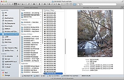 I have a catch-all folder in which I work on random images and Word files for each issue. Then I have individual folders for articles I am working on that hold all the pictures for that article. In this screen shot I have both open in two tabs (you can have many more tabs open at a time -- I only needed these two this morning). You can see the two tabs near the top of the window -- it's handy only needing one Finder window open for multiple folders.
The absence of differences may not seem like a feature at first thought, but I remember getting past upgrades and having to stop to Google solutions to new settings and issues I didn't really like or want. I poured over 'Mac OS X Annoyances' articles in the tech journals to figure out how to get beloved settings back. It took hours to get back to just working.
Not having to do that with Mavericks is a huge deal to me. And then discovering new features as I need them feels like I really did get something that is useful and extends the previous capabilities of the computer. I also had the joy of discovering that all the apps that I use every day still work. So revolutionary? Maybe under the hood, but not at first look. But worth it? So far, really good.
What is revolutionary is the price. I was a died in the wool Windows guy for a lot of years and I came to think the $100 ($200 for Pro) upgrade price was normal. When I bought a Mac and was presented with my first opportunity to upgrade to the next major version of OS X I was stunned to learn it was only going to cost $30. Microsoft temporarily matched that a year or two ago for a limited time. Will they do that again? Because the upgrade to OS X Mavericks is free. That's right, zero dollars. Just open the App Store and click 'Install' and Mavericks is yours.
My wife and I recently updated our iPhones to iOS7. I really like the new look and feel and features. The only thing I don't like is that the new calendar design is confusing at first and it is really hard to see which day is marked as 'today' because it is not differentiated enough. She really doesn't like OS 7. Too many changes from iOS 6, which she loved.
Maverics brings the iOS 7 look to the apps that can be found on both platforms. So if you are in my wife's camp on iOS 7 you may want to hold off.
But if you are in my camp, go ahead and update your Mac to Mavericks. Clearly a big part of the strategy is to make the computer as much like the phone as possible. That means the calendar is the same, iBooks is now a computer app, Apple Maps (which I think has been maligned a bit too extremely because it works just fine, at least for the casual user like me) is, too. They all work and look the same as on the iPhone, and they can talk to their iPhone counterparts. For example you can plan a trip on your Mac and transfer it to the phone (I haven't tried this yet) so you can have turn by turn instructions on your phone screen and voice. The password Keychain is iCloud connected now (again something I haven't tried yet since I prefer the 1Password app), so if you tell Safari to remember a password it will remember it on all your iDevices.
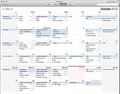 I like the new calendar look except I can't easily see when today is. If I concentrate I can see it, but subtlety is not really what I want here -- I want a big honkin' visual marker (and I want to be able to set whatever it is to be myself). Otherwise I really like the new calendar app.
Having used Mavericks for less than two days as of this writing, I am not going to be able to run you through the 200 features, many of which I won't ever use. But, like any new major piece of software, I am slowly using some of them. For example, finder now has tabs so you can have multiple folders open in one window. You can open a folder in tab 2, then go back to tab 1 and drag a file or files up to the tab 2 tab (it's much easier to do than to say).
I used to have three to five Finder windows open at any given time. That was OK, but with lots of other programs (apps in today's lingo) open it was hard to find the right Finder on my screen. Now they're all in one place. Nice time saver.
Except for that 'today' thing I like the new calendar. It is more flexible to use, and adding events is still easier, though it seems simpler. I still wish I could have more flexibility in setting visual cues -- like background colors for certain kinds of events to differentiate them from other kinds and my own background color for 'today' -- but I like being able to scroll through months instead of having to keep clicking the 'Next' button.
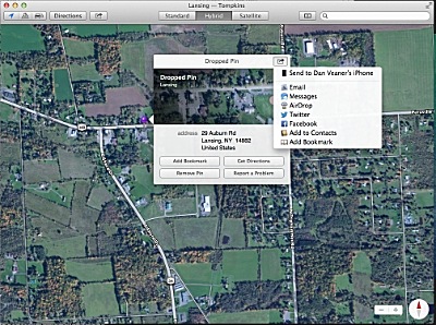 I dropped a pin in the parking lot of the Lansing Town Hall, and am given all kinds of options, including sending it to my iPhone so I can use that to find our seat of government in my car. Sure, the original iPhone Apple Maps got people hopelessly lost in a state wilderness in Australia, but it seems to know Lansing pretty well and Apple has a huge stake in overcoming those intial glitches.
I played with Maps a bit -- I like it. Drop a pin and you can not only use it to get directions, but you can send it to your phone, to Facebook or Twitter for folks who are in to that sort of thing, add it to contacts or map favorites or email it.
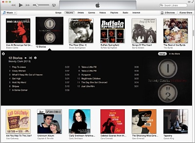 iTunes seems prettier to me, and smarter about playing things in its various sections (including continuing to play samples from the iTunes store while I browse back over my own collection). New conveniences like Apple Radio and iCloud integration are frosting on the cake.
I also like the newest iTunes. The new Radio feature is nice and they have the old radio options (you have to enable 'Internet Radio' in Options), and I like the look and feel of it. Airplay options are better than ever. In fact I've read you can stream your computer screen to Apple TV now (again not something I've tried since our TV is in a different room from the computer). I never liked the iBooks store so I settled on the Kindle App for my iStuff. But while trying them all out I bought a few books and it is nice to be able to see which ones they were and read them on my computer with the new iBooks app for Mac.
So after a day and a few hours what do I think the best things about Mavericks are? Well, the price can't be beat. I love that I could continue my work without worrying about new features at all. And in my slow but steady discovery of new features I am liking improvements to Finder. After a brief glance at the new (to OS X) apps I am favorably impressed.
v9i40


