- By Dan Veaner
- Business & Technology
 Print
Print 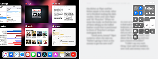 Control Panel is the same on an iPhne, accessed by swiping up from the bottom of the screen, while double clicking the Home button brings up the app switcher. on the iPad they used to be together on the same screen, but in iOS 12 they have been separated. Swiping up or double clicking the Home button displays the app switcher, while swiping down from the top right portion of the screen displays Control Panel. Swiping down from the middle or left top displays the Notification Center on both devices as it did in iOS 11.
Another year, another iOS! iOS 12 showed up on iPhones and iPads Monday, and, as usual, I was quick to upgrade. Apple claims "iOS 12 is designed to make your iPhone and iPad experience even faster, more responsive, and more delightful." So I was anxious to see how fast my phone and pad would become, and how delighted I would actually be. The new operating system is compatible with phones going back to the 5s and the iPad Air, so my iPhone 6 Plus and iPad mini are both compatible, and even with the 6th generation iPod Touch.
Some upgrades are so stunningly different that it feels like you have gotten a new device, even though you haven't. That certainly raises the delight level. But most iOS upgrades are less obvious, also a good thing because it means that for the most part you have no learning curve, so can continue to be productive without pause. Less delightful, but, in the big picture it is what I have come to like best.
Apple is claiming iOS 12 will improve your device's performance with up to 70% faster swipe to Camera speed, up to 50% faster keyboard display, and up to 2x faster app launch under heavy workload. I had read that you would especially see performance improvements on the iPhone 6 Plus, which happens to be the model I have. i have to admit that I don't have tools to objectively measure these things, and subjectively I am not noticing speed-ups except that swiping to the camera from the lock screen is clearly faster. But I am not complaining about the other things -- I didn't think they were too slow before, so if they actually are faster, at least they're not slower!
The first thing I like to do is check out the things I do all the time and see if I have to do something differently. Of the features and apps I use all the time, there were virtually no differences.
The one significant difference I noticed is that Control Panel is accessed differently on the iPad than it was in iOS 11. In the previous version it shared a screen with the app switcher. You could access it by swiping from the bottom of the screen or by double clicking the Home button. in iOS 11 the app switcher is accessed the same way, but Control Panel is accessed by swiping down from the upper right of the screen. Separating them means you can see more apps in the Switcher, and the new gesture to access Control Panel is easy. I use Control Panel all the time to adjust my backlight level, volume, to turn on Airplane Mode, and so on, so this mattered to me. I very quickly decided I like the new approach much better. And it is the same as in iOS 11 on the iPhone, so no issues there.
I rarely use Facetime, though I like it very much when I do use it. However I doubt I will want to FaceTime with 32 people at once. If I want to, however, evidently I now can.
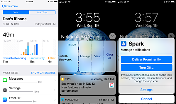 Screen TIme (left) shows you how productive -- or not productive you are being on yhour iPhone or iPad. You can manage your notifications while loking at them by swiping one to the left (center), and then choosing (right) how you want a particular app to notify you of things... or not.
One of the big things on Apple's list of new features is Screen Time. Screen Time keeps statistics on how you are using your phone, and additionally allows you to limit the time you -- or your kids -- are allowed to spend using certain kinds of apps, such as games, for instance. I have mixed feelings about it. I do like seeing the stats attractively displayed. But I am embarrassed at how much time I spend playing a tile-matching game, especially because I am the opposite of a gamer (this game is the one exception). It's not as if someone else will see my stats, but somehow I feel I am being watched, and the sneaky me wants to somehow exempt the tile game from Screen Time's data gathering.
Notifications seem to have gotten more active since I upgraded, which I like in some instances and not so much in others. Even in the lock screen you can swipe a notification to the left to be given options, including managing notifications from that app.
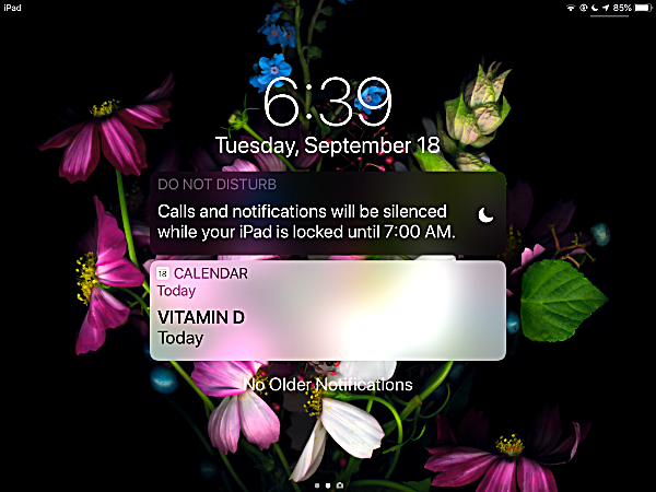
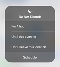 And because I am an insomniac, just about the first thing I noticed was that Do Not Disturb is very visible in Notification Center. You can turn it on and off quickly by touch-and-holding the crescent moon icon in Control Center, and Notification Center reminds you that it is on and tells you when it will be turned off.
There are some new photo sharing options, and Apple says searching for photos in the Photo app is smarter now, allowing you to search for events or people or places.
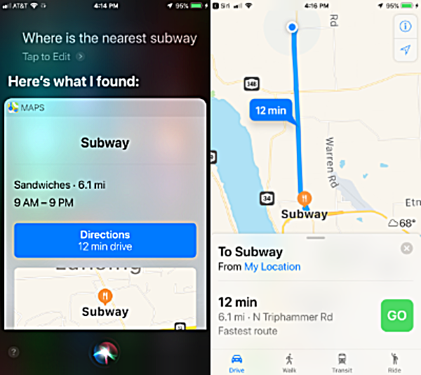 Siri and i are still not friends, though I concede that she can be useful sometimes
And Siri.. oh Siri... I have made no secret of the fact that Siri doesn't like me and the feeling is mutual. But I admit she has become able to do more things. M biggest beef, after her snarkiness, is that for a voice assistant too many of her responses are on the screen and not an audible reply. So if I am driving and ask Siri where the nearest Subway is, she says, "Here's what I found", but displays what she found on the screen without also telling me out loud what she found. On the other hand she does show me a big button that loads Apple Maps all ready to take me to where my favorite sandwich is. And I have to admit that I am becoming partial to Apple Maps for in-car directions. I still use a Garmin GPS, but I find myself using Apple Maps more and more.
The apps that come with iOS have all been updated. That includes Apple Books, Stocks, Voice Memos, News, Safari, Wallet, Messages, and Siri. Of these I probably use News the most. I didn't like News when it was first released, because it seemed to want to give me more news about Price Harry and Dutchess Meghan, and less news about... well... what's important. Sure, it let me choose news sources like The Lansing Star, but it also seemed partial to things like rumors about Apple and pop singers' Hollywood stars' hijinks, which I suppose I could care less about if I wanted to bother, but I pretty much couldn't care less about them. It displayed these various topics seemingly randomly. So I used a different app for news.
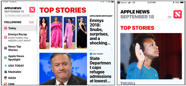 You can choose the order of things in the News app on the iPad (left) very easily. On the iPhone (right) it is less handy, but still doable without too much trouble.
But that app didn't seem to discriminate very well about what was important to me, and never did get the hint that I am not interested in sports news, being entirely sports-impaired. So I recently started using Apple news again. The thing I like best about iOS 12's version is that I can set the order of news sources to suit my tastes. That is especially wonderful on the iPad where a list of sources is displayed on the left of the screen in landscape mode, and via a prominent button in portrait mode (I keep my iPad locked in landscape mode anyway, so I am really loving this.
If you want the whole ball of wax -- all the new iOS 12 features -- you're going to need a new phone. Animojis and Memojis are only supported on iPhone X or later. You also need a newer phone to take advantage of Augmented Reality (AR). Apple is touting a new Measure app that requires AR to measure things just by pointing your camera at them. With my older phone I can forget about that, though. To bad... that is something I could use, but it doesn't motivate me to shell out between $600 and $1K for a new phone.
As I write this I have had iOS 12 for two days, but have not noticed any problems using it. And using it is mostly identical to using iOS 11, so I can't say that I am ridiculously delighted. But I do think it is a worthwhile upgrade, even on my older phone. Wow, my phone is only four years old and it is already four major models behind. Yet it still works great, and iOS 12 seems to me to be making it work even greater.
v14i36


