- By Dan Veaner
- Business & Technology
 Print
Print 
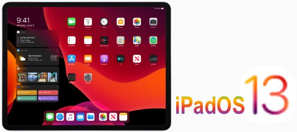
Apple had a surprise for iPad users Wednesday -- iPadOS 13.1 dropped a week before the announced release date. iPadOS is the new operating system that is exclusively for iPads. Previously the iPad shared iOS with the iPhone, but Apple has split iOS into two separate OSs. Even when they shared an operating system the two devices had different features. But now each OS is optimized for the specific device, which may account for part of the increased speed of both OSs. So in a way the new OS is version 1, not 13.1. But realistically is is a branch of iOS 13, so lucky 13 (point one) it is!
I had marked the September 30th launch date on my calendar, so I was surprised when I noticed my iPad was ready to upgrade. The download and install time was much faster than past iOS updates. That may be, in part, because I just updated to a new iPad mini. So all I can say is that it didn't take long to download or install. Verifying the download was the longest part of the process. And the first thing I noticed, when I swiped right on the home screen (quite by accident) was that the widget panel appears over the Home Screen. Evidently you can make it part of the Home Screen as shown in Apple's graphic above. But evidently that is not an option on the mini.
You can still see the widgets by swiping down from the top of the screen to view notifications and then swiping right to access your widgets. I use widgets all the time to check my calendar, the weather, to turn lights on and off, and browse headlines. So accessing them in one swipe is a major convenience for me. I am hoping Apple will allow the widgets to be part of the home screen on the mini in a future update. The screen isn't that small -- I'll still be able to see the smaller icons, Apple, even with my failing eyesight.

The next thing I played with was multitasking. iPadOS has split screen, which allows you to view and use two apps on the screen at the same time, and Slide-over, which places one or more apps in a vertical column that hovers over the open app. Previous versions of iOS allowed you to have one Slide-over app at a time, but iPadOS lets you have multiple tiles open at a time.
In the past I have used Slide-over to display the Clock app so I could see what time it is while using apps that don't display the time. This happens in some apps that don't display the top iPad status bar (the one with the little battery, wifi bars, and so on. I am partial -- OK, I admit it, addicted. I really need a ten steps program for this -- to a little tile matching game that takes up the whole screen. My saving grace is that clock in a Slide-over tile that I can quickly check to make sure I haven't matched tiles into my next appointment, or just to confirm that I haven's spent hours doing it. With iPadOS I can also have my dictionary app close to hand, or really, any app.
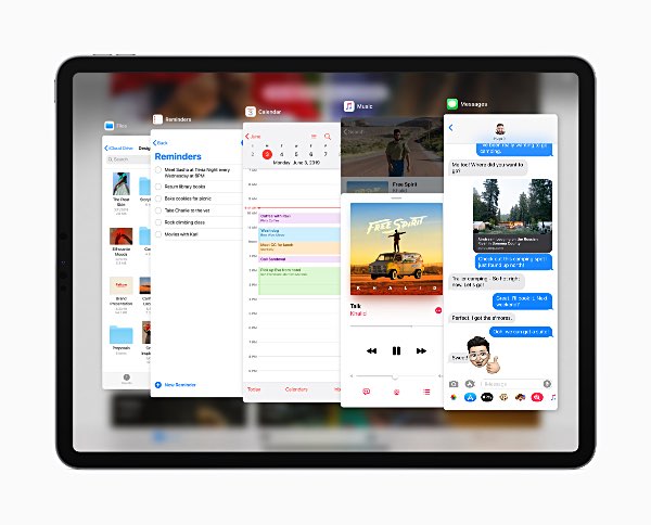
You create a Slide-over tile by swiping up from the bottom of the screen to display the dock, and then touching and holding an icon in the dock and swiping it up into the app that is currently loaded. You can make the tile go away by swiping it to the right until it is off the screen, and then you can swipe from the right edge of the screen to display it again (over any app). Multiple tiles are handled in much the same way multiple apps are. You swipe upward until they are all displayed. From there you can either select the one you want to see or swipe up to close a particular app.
Speaking of that, iPadOS uses the relatively newish routine of swiping from the bottom of the screen to the middle to display each open app so you can quickly move between apps or close them.
In general I prefer the traditional black text on a white background, so I wasn't excited about Dark Mode on my phone or iPad. But since I opted for Light mode on the phone I decided to try Dark Mode on the pad. The saving grace is how crisp the iPad's display is. While Light mode is theoretically more legible, Dark Mode is plenty legible in iPadOS. The only thing is that it isn't used by most apps. They continue to display in what looks like Light Mode, or whatever mode they previously displayed in. The Apple apps do honor the Dark Mode settings, and one might expect that if Dark Mode turns out to be a hit more independent developers will enable it in their apps. It is a little jarring to go from dark to light to dark to light, so I will almost certainly go back to Light Mode as my default.
Apple promised a speed bump in both the phone and pad OSs, and it is quite noticeable in iPadOS, For instance, I use the Ambient Weather app (it displays the temperature in my house), which used to pause noticeably while loading. Now it pops right up.

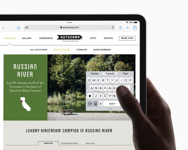
One new feature is the ability to minimize the keyboard so you can type with one hand. It is a floating keyboard -- you can move it around the screen. As with most items, you swipe inward with two fingers to make something smaller, and outward to enlarge it. Now my one pet peeve about 'those kids today' is how much of their time they spend typing so very fast on the tiny keyboards on their phones. It's not because I am old (I am, but that's not why). It's because I'm jealous. Because my fat fingers are too big for those little keys, so I can't do it.
So why would I want to make my iPad keyboard smaller? Well, I tried it, and it was darn handy holding the pad with one hand and still being able to type. Sure, the keys are smaller, but they weren't impossibly so. I do love the bigger iPad keyboard and prefer to text, for example, on it rather than on my phone when both are available.
iPadOS also has QuickPath typing, which is supposed to be faster because you keep your finger on the keyboard and simply move from key to key. I didn't have much luck with it on the iPhone, and am having the same problems on the iPad. I keep getting words I didn't intend, and that's if swiping works at all. That thing where you can touch and hold some letters to get accented versions sometimes happens when I want to swipe between keys. So QuickPath typing is a skill that requires a learning curve that may not be worth it, at least for people like me. Since I took that typing class in High School I've gotten pretty fast. And while I tap way too hard (because of the old Olivetti Underwood typewriter I used in those days, which you just about needed a sledge hammer to get the keys to type) I am a very fast typer.
Once iPadOS installed it asked me to set up Apple Pay. My iPad is wifi only, so I was surprised, as previous versions didn't have the Wallet App -- it was iPhone only. But I figured what the heck and configured it, only to find that there is no Wallet app on my iPad. I know from using my phone and a Mac that Apple Pay can be used to fill in forms when shopping ion the Web. I haven't tried it on the iPad yet, but I guess that's what the setup was there for. My Apple Card (see my review of the Apple Card in the next issue of the Lansing Star) and Apple Cash card are enabled and I guess can be changed on the iPad now in the Settings app. So we're not talking about using Apple Pay in stores as you can with the iPhone, but more about using it when shopping on the Web.
iPadOS 13.1 has many other features, many of the same ones introduced in iOS 13 last week. So I won't repeat what I said in my previous review. One of them that I didn't mention last week is that the new OS is supposed to be more sensitive to input from the Apple Pencil. I use an off-brand stylus, and it does seem plenty responsive in the new OS. Apple says you can mark up entire Websites with the Pencil. I must be missing something, because I don't seem to be able to figure out how to enable this feature. Maybe it's because I don't have an Apple brand stylus. Or maybe I just need to stumble around the new OS a while longer.
iOS 13.1 also became available Wednesday, reportedly to fix a bug that allowed someone to bypass the lock screen to access your contact information when using Facetime. The update also added the ability to share your ETA with friends when using Apple maps.
Bottom line, is it worth upgrading to iPadOS? You know, it's the little things, and that ability to swipe the widgets into instant view on the home screen alone make it worth it for me. And the multitasking -- especially Slide-over that now loads more than one app at a time (although I did enjoy experimenting with Split Screen, which was not available on my old iPad) -- is another key feature that factored into my decision to update as soon as iPadOS became available. So I say thumbs up, yes, it is worth upgrading.
v15i37


