- By Dan Veaner
- Business & Technology
 Print
Print 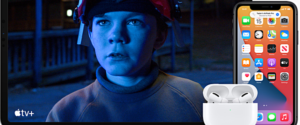
Another September, another mobile operating system from Apple... or systems: iOS, iPadOS, and tvOS version 14 have all been released. It must be a measure of my satisfaction with iOS13 that for the first time in years I didn't notice iOS 14 was available until five days after it was released. When I did I updated all three, and here are my first impressions. For the most part, as in past years, the human experience (versus the under the hood enhancements) isn't much different, but the new OSs add features to what we already had. That means there is virtually no learning curve.
The one thing that is obvious when you first start using 14 is that widgets have been added and improved. I use the widget screen often on both my phone and iPad, so this was a bit confusing at first, since the new and improved widgets are on top. I scrolled down to find my old widgets looking decidedly not new or improved. Eventually the 3rd party developers will, no doubt, update the look and feel of their widgets, which remain the most useful for me because, after all, I told my devices to use them.
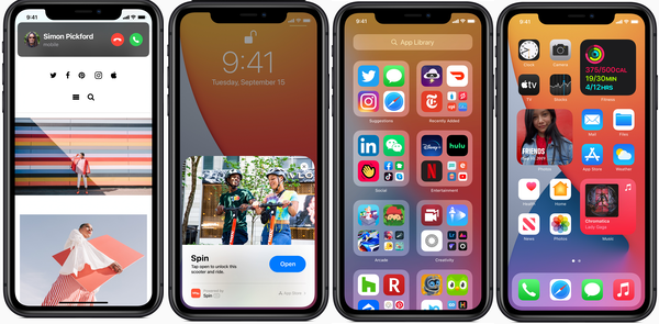 From left: New compact screen for receiving calls; App clips on the lock screen; the App Library; Mixing widgets with apps
You can even make a smart stack of widgets -- essentially a widget that contains more than one other widgets, which can be scrolled within the encapsulating widget.
To access the widgets on the phone you swipe right from the home screen or lock screen and there they are. That's not new. But two things are new. On the iPhone you can put widgets on your home screens so they co-mingle with your app icons. I tried this on my phone and I liked it, but since my home screen was full of apps the widgets pushed some of the apps I use every day onto another page -- so I removed them, but may rethink what I consider essential for that initial page in the future.
Speaking of app icons -- evidently there is a way to make your own to replace the ones that come with the apps. I believe it involves a third party app like Widgetsmith plus Apple's Shortcuts app, but I haven't explored doing this (you'd want to have time on your hands).
And if you swipe left one screen past your last app screen you get the new App Library, which organizes all the apps you have on your phone by category. I can see this being handy, except for having to scroll over all those screens (if you have a lot of apps) to get to it. No problem. Tap and hold the home screen in order to edit it (the icons jiggle and there are Xs next to each for removing them. Now tap the dots that denote the various home screen pages at the bottom of your screen. Images of each screen appear with a check mark beneath them. Uncheck them and they will not be displayed. I unchecked all but my first two screens so I can easily access all the other apps with two swipes.
iOS and iPadOS 14 make things more compact than previous versions. For example, when receiving a call it used to be that the phone screen with the Accept and Decline Call buttons covered up whatever app you were working in. Now a banner with those buttons appears at the top of the screen, which will, no doubt, help you retain your train of thought if you decide to decline the call. Siri has also become more compact, most notably with a small circular icon instead of that long sound wave at the bottom of the screen. Apple says Siri has 20 times more facts than before, and can send audio messages.
This is a small thing that is a big thing. You know those little icons at the very top of your phone or iPad screen? Little indicators have been added to the ones on the right hand side that light up when your camera or microphone are being used.
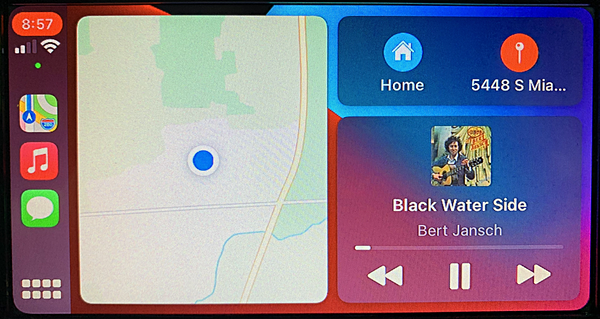 Festive CarPlay Wallpaper
I have been using CarPlay for over a year now, so I packed away the Garmin and have been using Apple Maps. I miss some features of the Garmin, but I do love Apple Map's traffic jam display and the way it automatically tries to route you around traffic if there is a faster route. iOS 14 introduces wallpaper for CarPlay to spruce up your screen. There are only a handful of choices, and in this version, at least, there is no way to create your own custom wallpaper.
There do seem to be more apps that are CarPlay compatible. Aside from the apps already on my phone, Apple says CarPlay now supports 3rd party parking, EV charging, and quick food-ordering apps. Things I haven't tried: sending audio messages with CarPlay.
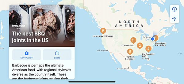
Maps also adds Guides, which can be handy as you travel. Many of them are guides to major cities, but there are also food guides and other things of interest. Maps now provides cycling directions using bike lanes, paths, and roads, and tells you about elevation, busy streets, stairs, and steep passages when planning a trip.
One interesting feature has to do with the Apple Pencil or any compatible wireless stylus pen used on an iPhone or iPad (that is new enough to accept stylus input). I have a third party one, because $129 for a second generation Apple Pencil is a lot of cash for something I am only experimenting with, as compared to $19.95 for the stylus I bought (and am impressed with) last year. I have played with two of the new features. The first is drawing shapes. Draw a star or a circle or a square and pause your stylus when you're done. Your wavy drawing is turned into a clean versions of the shape.
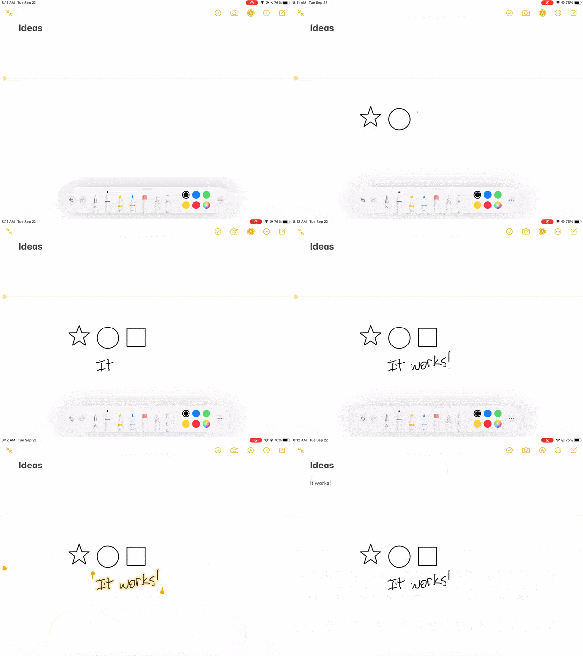 Some things you can do with a wireless stylus pen and iPad
Another cool feature is 'save as text'. Write something with your stylus. Now press and hold and use the little beginning and end thingies to select your handwritten text. Touch it, and select 'Save As Text' from the little copy/paste bar that popped up. No go into the text portion of your document (or another document) and touch the screen to get the copy/paste bar back and choose 'Paste'. The words you wrote are pasted, but in typed form. And bad handwriting evidently isn't an issue, at least in my case).
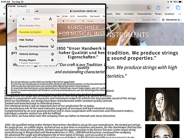
iOS 14 adds a new Translate app, similar to Google's. But translation doesn't end there. In iOS and iPadOS if you are looking at a Web page in a foreign language, Safari can translate it for you. Just touch the AA icon in the address bar at the top and ouch 'Translate to English' in the resulting drop-down menu, and presto! An English version with a pretty decent translation. I found this works better with some pages than others -- it hung up on one page I tried. But generally it is a very welcome feature.
As for tvOS 14, there are relatively few new features, but if they are things you wanted, now you have them. 'Picture in Picture' has been added so you can keep watching a video or look at a picture while working in another app. There are also new features for AirPods, plus the ability to see 4K streaming videos. If you are a gamer, multi-user support has been added. Home controls are also new, and there are new screensavers. And, of course, new memojis -- not really for me, but a lot of people seem to love them. So far I haven't used new features -- I think the only one I would use is the 4K streaming, but to be honest we don't use our AppleTV as much since we got a Roku television set. The Roku apps don't seem to be as stable as the Apple versions, so we do still use the AppleTV when a Roku app wigs out, or when we want to airplay something from a phone.
There are a number of new features I haven't gotten to in iOS and iPadOS 14. I have to admit that I don't understand app clips -- these are compact versions of apps. From what I have read there aren't many available, so I expect they will become a bigger thing later if companies adopt them widely. There are some tutorials on the Web for things like ordering food from Panera -- I tried it and didn't see what the big deal was, except that doing it from the Maps app was handier than going to the website in a browser.
the 14s remind me of the old saying about 'death by a thousand cuts' except much more upbeat: productivity by a thousand little improvements. If I could find this many items that I know I will use in just one day, then 'd have to say that 14 -- for iPad and iPhone, at least is a winner.
v16i38


